
Pick 3 Brand Words to Guide Your Design
- Kameron England
- Jan 1
- 2 min read

Updated: Jan 9
If branding ever feels overwhelming, you’re not alone. Colors, fonts, photos, captions, logos, it can start to feel like too many decisions at once. One of my favorite ways to simplify the process is by starting with just three words.

Before choosing anything visual, pause and ask yourself
How do I want my brand to feel?
Not how it looks, not what it sells, but how someone should feel when they land on your website or scroll past your post.
Why three words work
Three words give you clarity without boxing you in. They become a filter for every design choice you make. When something feels off, you can come back to your words and ask, does this actually match?

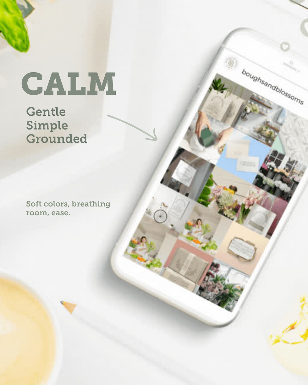

You’re no longer guessing, you’re choosing with intention.
How to use your words in real life
Once you have your three words, use them everywhere.
Choosing brand colors
Picking fonts
Selecting photos for your website or social media
Writing captions and website copy
Designing graphics or templates
If something doesn’t align with at least two of your words, it probably doesn’t belong.
A gentle reminder
Your brand doesn’t need to do everything or appeal to everyone. Clear brands feel better because they’re consistent, and consistency
builds trust.
If you’re building a brand or refreshing one, start here. It makes everything else easier.
I shared a visual breakdown of this tip on Pinterest that walks through examples and a simple checklist. You can save it, revisit it later, or use it as a reference while you design.
If you ever want help choosing your three words or translating them into actual design choices, that’s exactly the kind of work I love doing.


Comments